Creating a cross-cultural design system

| Timeline | Platform | My role |
| 12 months | Web | Product Designer |
scoutAsia is an AI-driven platform focused on providing news and corporate data about Asia. Jointly developed by Nikkei and the Financial Times, it aims to make Asian business information more accessible to foreign enterprises. They embarked on a transformative journey to develop a design system, addressing the inconsistencies and inefficiencies in its user experience and development processes. This initiative aimed to enhance usability, improve development efficiency, and establish a scalable system that serves as a single source of truth.
My responsibilities
- Deliver a scalable design system adaptable to future updates and expansions
- Document the design components and guidelines
- Coaching internal teams in London and Tokyo
- Integrate scoutAsia brand into the new system
All information in this case study is my own and does not necessarily reflect the views of Financial Times and Nikkei.
High-level goals
There was a need to conduct user research in Tokyo and London, to integrate cross-cultural insights into the design process. The objective was to inform the development of a user-centered design system aimed at improving the overall user experience and consistency across scoutAsia. The key objective was to simplify the development process to reduce the time and resources spent on implementation and maintenance, ensuring a more efficient and effective workflow.
Reflecting on our impact
Post-implementation surveys showed a 40% increase in overall user satisfaction, with users finding the platform more intuitive and easier to navigate. User engagement metrics, such as time spent on the platform and the number of sessions per user, increased by 35%. The standardised design system reduced the average development time for new features, allowing the team to deliver updates more quickly. Additionally, incorporating insights from Tokyo-based research improved the platform’s relevance and usability for diverse user groups, leading to a 15% increase in international user retention.
Challenges
- The existing design lacked uniformity, leading to a disjointed user experience.
- Without a standardized design system, developers faced challenges in maintaining and scaling the platform.
- Ensuring the design system met the diverse needs of users across Asia required extensive research and collaboration.
Cross-cultural Research
I travelled to Tokyo to collaborate directly with the local development team from Nikkei. During my time there, I conducted contextual research to understand the workflows and challenges faced by the developers. This involved extensive user research to gather insights into their processes, preferences, and cultural nuances. By immersing myself in their work environment, I was able to tailor the design system to better meet the needs of users across different cultures, ensuring it was both relevant and effective for the diverse scoutAsia user base.

Key learnings
The research highlighted the need to incorporate culturally relevant design elements, establish clear communication channels, and develop a scalable, consistent design framework. These insights were essential for customising the design system to address the diverse needs of scoutAsia’s users, ensuring it was both user-friendly and developer-friendly.


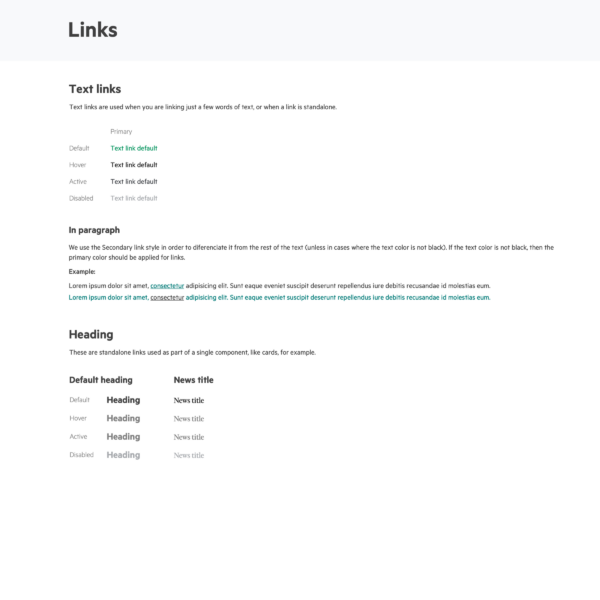
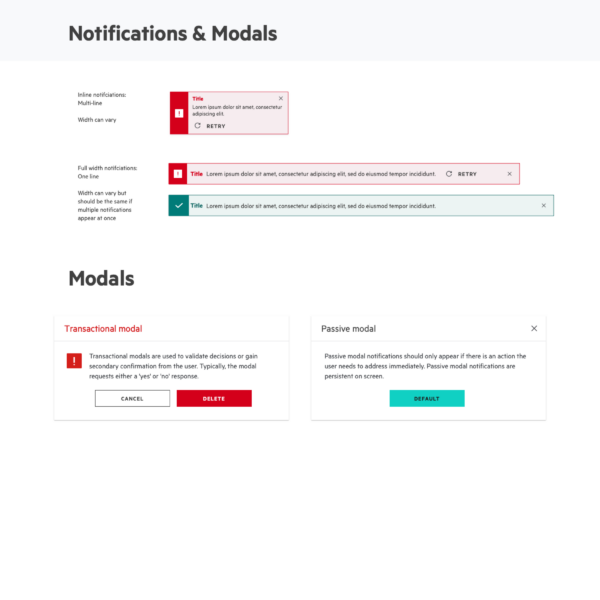
The solution
Using the Sketch library in conjunction with Zeplin to document the design components and guidelines was a crucial decision for scaling and delivering the project efficiently. We developed comprehensive design guidelines that ensured consistency and scalability. These guidelines covered all aspects of the design, from typography and colour schemes to component libraries.


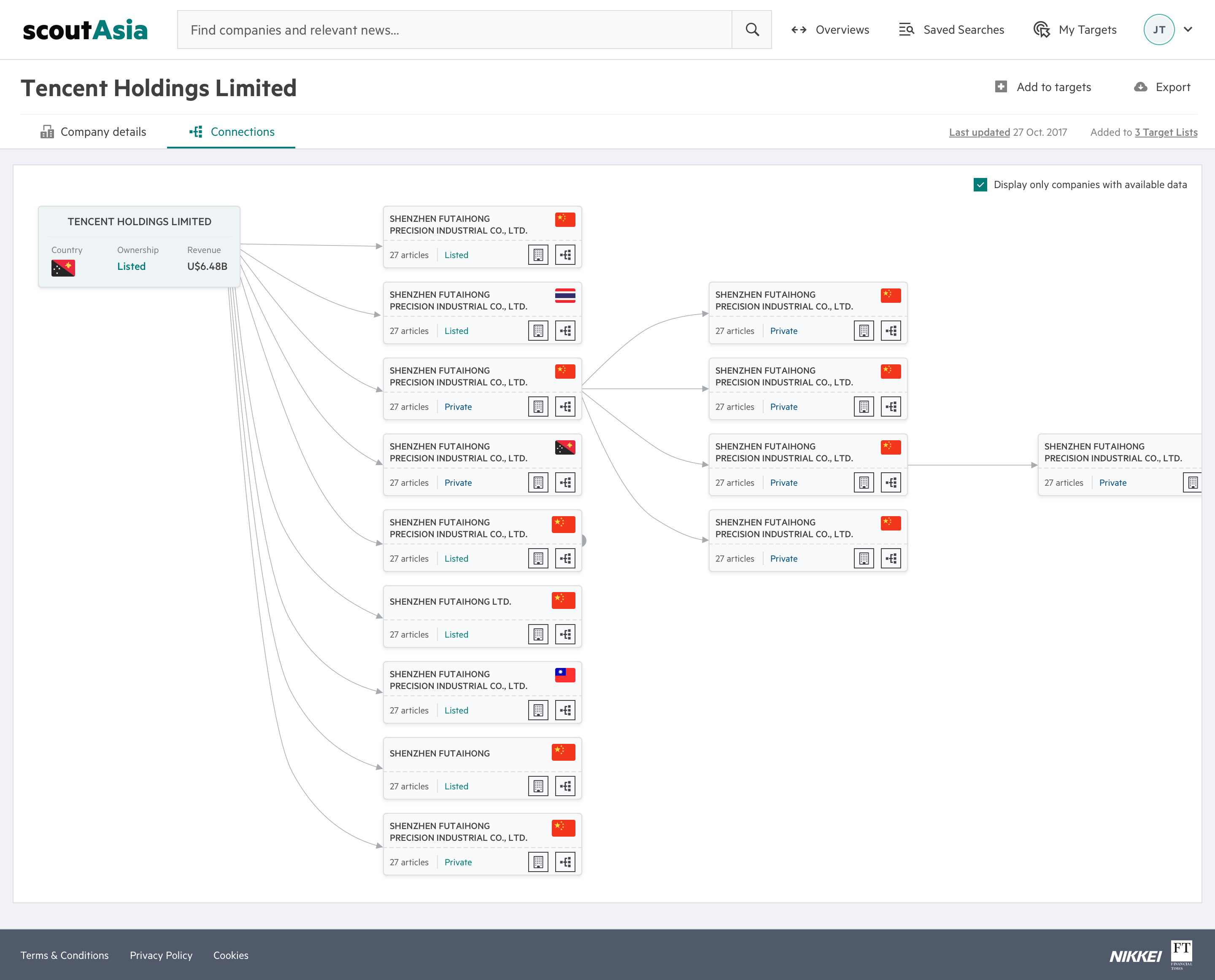
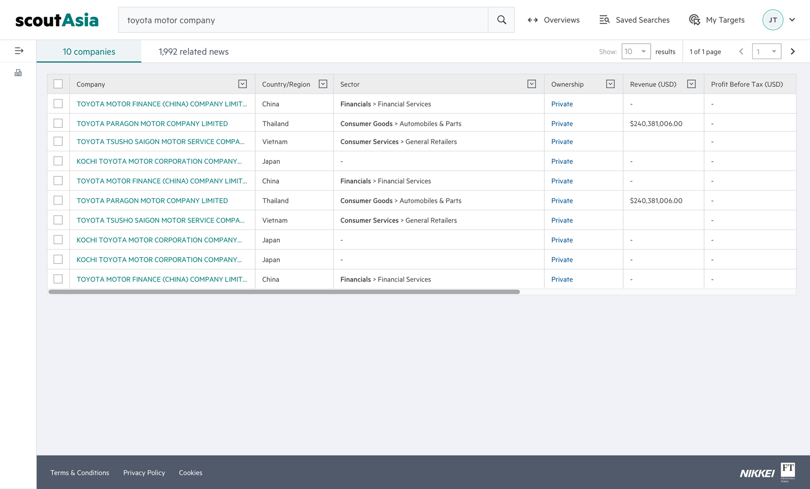
The Design System in action
These improvements demonstrate the significant impact of the new design system on scoutAsia’s performance, user satisfaction, and operational efficiency. By addressing key challenges and using cross-cultural insights, the project successfully positioned scoutAsia as a more user-friendly and efficient platform in the Asian business intelligence market.