Project

Lloyds Mobile app

Lloyds Mobile app
review rate
0
customers
0 m+
downloads
0 m+
01 —

Overview

Lloyds Bank is one of the largest retail banks in the UK, serving millions of customers who rely on its mobile app to manage their finances daily.

By the time this project started, the Lloyds app was a mature, business-critical product operating in a highly regulated environment, while the organisation was also undergoing a broader brand transformation.

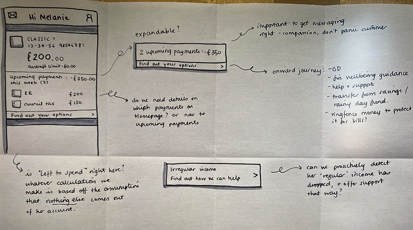
This project focused on reframing and redesigning the everyday banking homepage, a critical, high-traffic surface, to better reflect real customer behaviours and support clear, deliberate decisions in a highly regulated, high-risk environment.

lloyds-01
02 —

My role

I  owned the end-to-end design direction for the mobile banking homepage to redefine how users understood their financial position, while navigating legacy constraints, regulatory requirements and multiple senior stakeholders.

03 —

The challenge

The Lloyds mobile banking homepage had evolved through incremental changes, resulting in a dense experience with limited information hierarchy. While functionally complete, it made it harder for users to quickly understand their financial position and make confident everyday decisions.

This challenge sat within a highly constrained environment, shaped by legacy systems, regulatory requirements and multiple senior stakeholders.

The opportunity was not to redesign the homepage visually, but to restructure how financial information was presented.

lloyds-previous-design
The everyday banking homepage — a critical surface used daily by millions of customers.
04 —

Framing the problem through behavioural research

The project didn’t begin with a clearly defined problem statement. Instead, it started as part of a broader rebrand, with a brief to rethink the mobile banking homepage.

This created an opportunity to step back and understand how customers actually manage their money day-to-day — what reassures them, what slows them down, and what they expect to see when they open their banking app.

I led primary research with both Lloyds customers and non-customers to understand everyday banking behaviours, decision patterns, pain points and moments of reassurance.

I check my balance when I'm at home. Usually in the morning… seeing what's gone out, what's pending to go out and the total sum.
— Lloyds customer
06 —

From user needs to design principles

Rather than thinking in terms of features, participants consistently framed their needs around reassurance, control, and timely access to information.

lloyds-user-needs
These behaviours shaped our design principles for this project.
#1 Clarity before action
#2 Surface what matters now
#3 Support different levels of financial confidence
The homepage should first help customers understand their financial situation at a glance before encouraging them to take action.
The homepage should answer “What do I need to know or do right now?” without overwhelming users.
The experience should feel reassuring, predictable, and flexible, adapting to different needs without requiring deep navigation or customisation upfront.
07 —

Ideation and alignment

These principles helped align multiple squads together, including  Transactions, Payments, Credit Cards and Engineering.

Early exploration focused on different ways of structuring financial information on the homepage, testing how users perceived balances, transactions and key account actions.

08 —

Exploration & Validation

These insights led to a focused solution that prioritised clarity, consistency and scalability across the homepage experience. Instead of converging on a single solution too early, I guided the team to explore two homepage directions.

Working across squads revealed different priorities. Transactions cared about visibility, Payments focused on speed, Credit Cards needed context, and Engineering pushed for long-term scalability.

Everyone was right — but for different reasons.

Research revealed two distinct mental modes when people open the app:

  1. “I just want to know everything is OK”  (reassurance)
  2. “I want to understand more / analyse”  (reflection)
This version assumed users would start from an account and drill down. Exploration was possible, but limited — Insights were separated, and other areas were effectively hidden behind individual account entry points.
This version allowed users to choose their focus first — Summary, Insights, or a specific area like Savings — and let the interface adapt around that choice. Instead of forcing navigation through accounts, the UI supported intentional exploration: reassurance first, then depth, on the user’s terms.

Rather than changing what information was available, we explored how the interface invited people to explore it.

09 —

The Outcome

Two distinct concepts were explored. However, the “pills” version consistently performed better because it respected the primary reason people opened the app: to understand their financial situation and act with confidence quickly.

This version feels calmer. I don’t feel overwhelmed when I first open the app.
— Research participant
10 —

Impact & Learnings

One of the key learnings from this project was recognising where design could drive the highest impact in a highly constrained environment — focusing less on visual change and more on information hierarchy, clarity and decision-making support for users.

This validated direction established a scalable foundation for the Lloyds mobile homepage, informing future iterations and ensuring consistency as the platform evolved.

The experience was launched as part of a wider rebrand and platform evolution and remains in use today across a product serving over 8 million digital customers, continuing to evolve as a core everyday banking surface.